Multi-media: Ceramics, Design, Wire, Metal, Leather, ink, slip, tea, mocha tea, cardboard, tissue paper, plastic, coffee strainer
One Steep is a personal tea kit to help young adults reconnect with themselves and to introduce or bring mindfulness back into their daily lives. This tea kit is especially designed to help students take time to relax and disconnect from the distractions of today’s culture. One Steep includes everything the users will need: one teapot, one cup, and two hand made teabags filled with loose-leaf tea.
The kit is a modern spin on traditional tea rituals. The Becoming One Ritual, gives the user two different ways of achieving relaxation and wholeness. By the end the user will be more aware of their mind and more aware of the present moment. Handmade ceramic teapots and cups fit together in a unique way to become one unit. The cup fits underneath the teapot, hidden from view when not in use. By hand building each teapot and cup it continues the idea of reconnecting to self. The design on the teapot is created from a technique called mocha diffusion, a growth of organic crystallized branches. This technique captures the beauty of nature elegantly and also uses black tea as one of the ingredients to make the mocha tea acid. By using ink and water, a similar aesthetic to the mocha diffusion designs on the teapots and cups have been incorporated into the packaging design. Creating these designs on paper is a very similar process as the mocha diffusion technique on ceramics. The key to creating both techniques successfully is being present; the artist must make sure to get the correct wetness of the material in order to apply the design.
This tea kit is a way to promote the benefits and meditative use of tea. The kit not only helps the user but also directly addresses the needs of college students who suffer from stress related disorders. With each One Steep tea kit sold, a percentage of the proceeds will be donated to the Anxiety & Depression Association of America, an international non-profit organization; whose mission is to help improve the lives of those who suffer from anxiety, depression, OCD, PTSD, and other related disorders. ADAA is the leader in education, training, and research for these disorders. They strive to improve the scientific knowledge about the causes and treatments for those who suffer. They truly care about people and want to work to reduce the stigma around these disorders and help spread awareness. For more information about this association please visit their website at www.adaa.org.
Download my thesis book to see my process.
Awards:
The James W. Strong Graphic Design Studio Achievement Award
The Monnier Family Foundation Outstanding Artist Award
ORPHEO CANDA
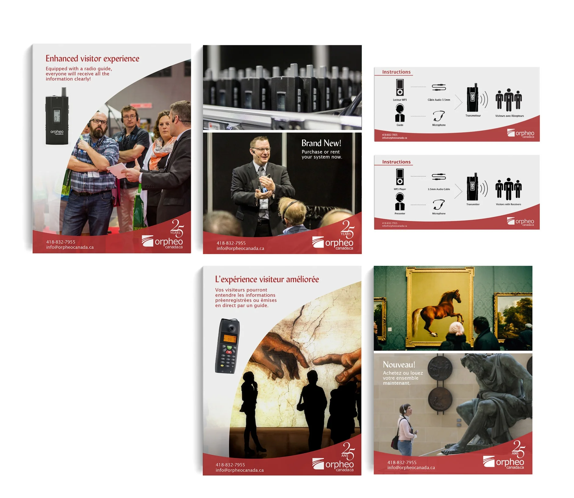
Orpheo Canada is apart of the world-wide Orpheo Network, they are celebrating their 25th year anniversary. Orpheo Canada is known for their audio guided tour devices that help visitors learn more about the world around them. They have a wide range of devices for multiple industries.
Mailing Advertisements: Brought on to create mailing advertisements for the company's different industries that their devices are used in; industrial, museums, parks, etc. Shown above are the advertisements created for their industrial and museum industries. Each advertisement was created in both english and french. A long with the creation of the mailing advertisements, a special logo celebrating their 25th year anniversary was added to these fliers.
Visual Instructions: In the top right corner of the image shown are the visual instructions for the devices. These would be given out to the users of the devices at museums, conferences and other locations. These instructions were created in english and french. Customizing all the icons on the instructions to show their devices.
BGSU Gallery Design Internship || Lead Designer
Face It Show: Photography Contemporary Portraits
For this show, I designed the posters, TV ads, banner, brochure, and helped with intake/ setup of the exhibition. The brochure displayed below was used to show a sample of the work that will be in the show and bios for each artists. These were given out to each of the artists in the show and were sold during the exhibition.
Rebranding:
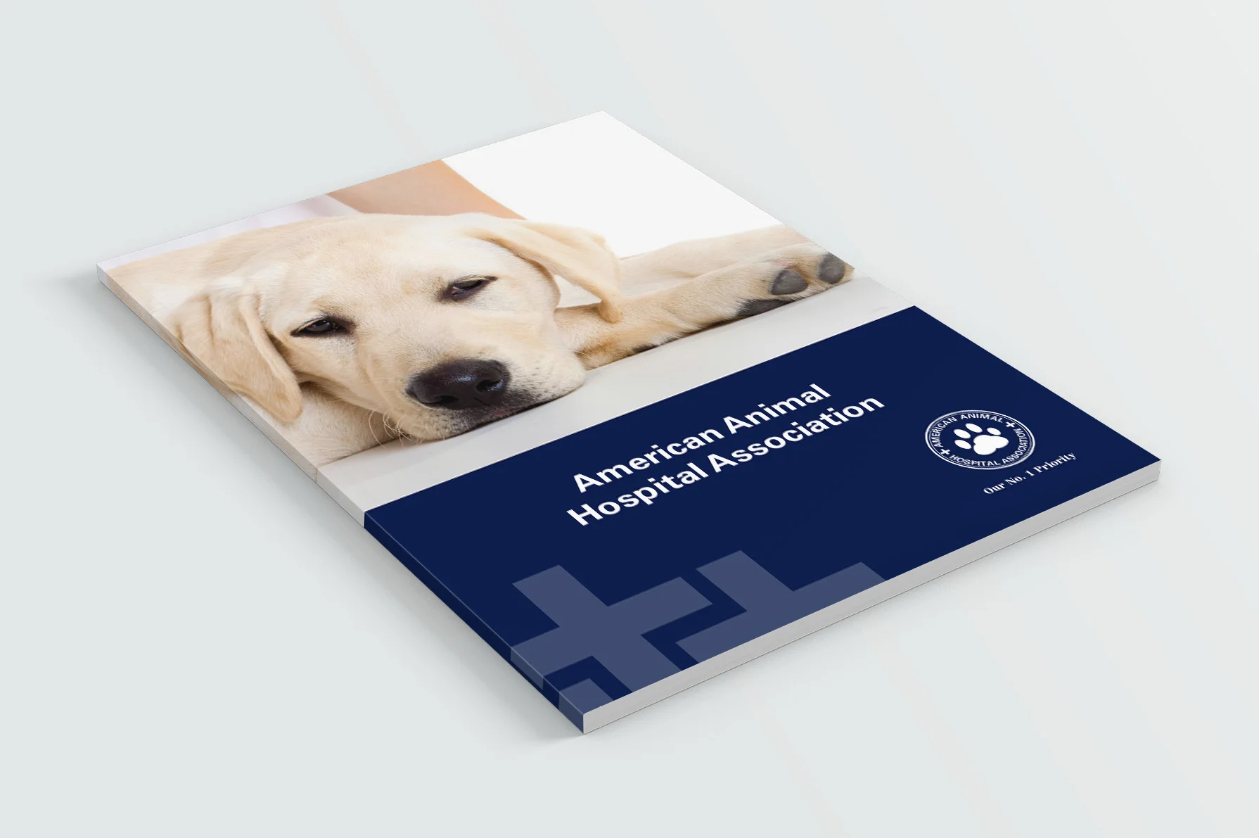
American Animal Hospital Association (AAHA) is the only accreditation a veterinarian hospital can be awarded. They strive to uphold the highest standards in pet care. Their number one priority is the health and care of all pets in the United States and Canada. To be accredited, the veterinarian hospital must go through a comprehensive evaluation, making sure the practice meets 900 qualifications for providing excellence pet care. AAHA is a member of Partners For Healthy Pets, and Human Animal Bond Research Initiative. They have also teamed up with the North American Veterinary Community and The Humane Society of The United States.
The AAHA logo is designed to show to high standard of care each accredited hospital must uphold. Their logo is a seal of honor each veterinary hospital and the veterinarians are awarded. The rings represent their full range of standards being from the most important medical details all the way to the fine details of how each clinic is set up. The parts of the logo that must be embossed to reference a seal are the rings and animals paw prints. The embossed paw print represents the seal of approval from the happy and healthy animals they treat. The paw print is the first thing they want their clients to see because pets are their number one priority. The cross symbols show their care and importance of providing the best medical care they can for your pet.
Innovations:
Comfort Kits: When a lot of animals come into a veterinarian hospital they are very scared and uncomfortable. Their number one priority is to make the animal feel more comfortable during the exam. In each of the exam rooms there will be a Comfort Kit for the animals. Each kit is stocked with a small, medium, and large calming vests for both dogs and cats. Also there is a waterproof blanket for the animals that do not enjoy the calming vest. These items will help create a more relaxing environment for the animals to be in. By successfully creating a welcoming inviting environment for the animals they are able to find out the issues the animals are having and fix them a lot faster.
For The Veterinarians: When a new member or team joins, each veterinarian will receive an AAHA Veterinarian White Coat and a AAHA Stethoscope. The white coats are made out of all organic cotton fabric for a nice breathable coat for the veterinarians to work in. The fabric is allergy free, so no animal will have any problems when interacting with the fabric. The AAHA logo will be embroidered on above the veterinarian’s name. Each one of the new veterinarian’s will be given a high tech stethoscope. These stethoscopes are made out the highest quality of material for the best hearing. Every two years when the veterinarian hospital passes their reevaluation, each member will be receive complimentary AAHA items to keep their team up to date with the best quality of equipment and gear.
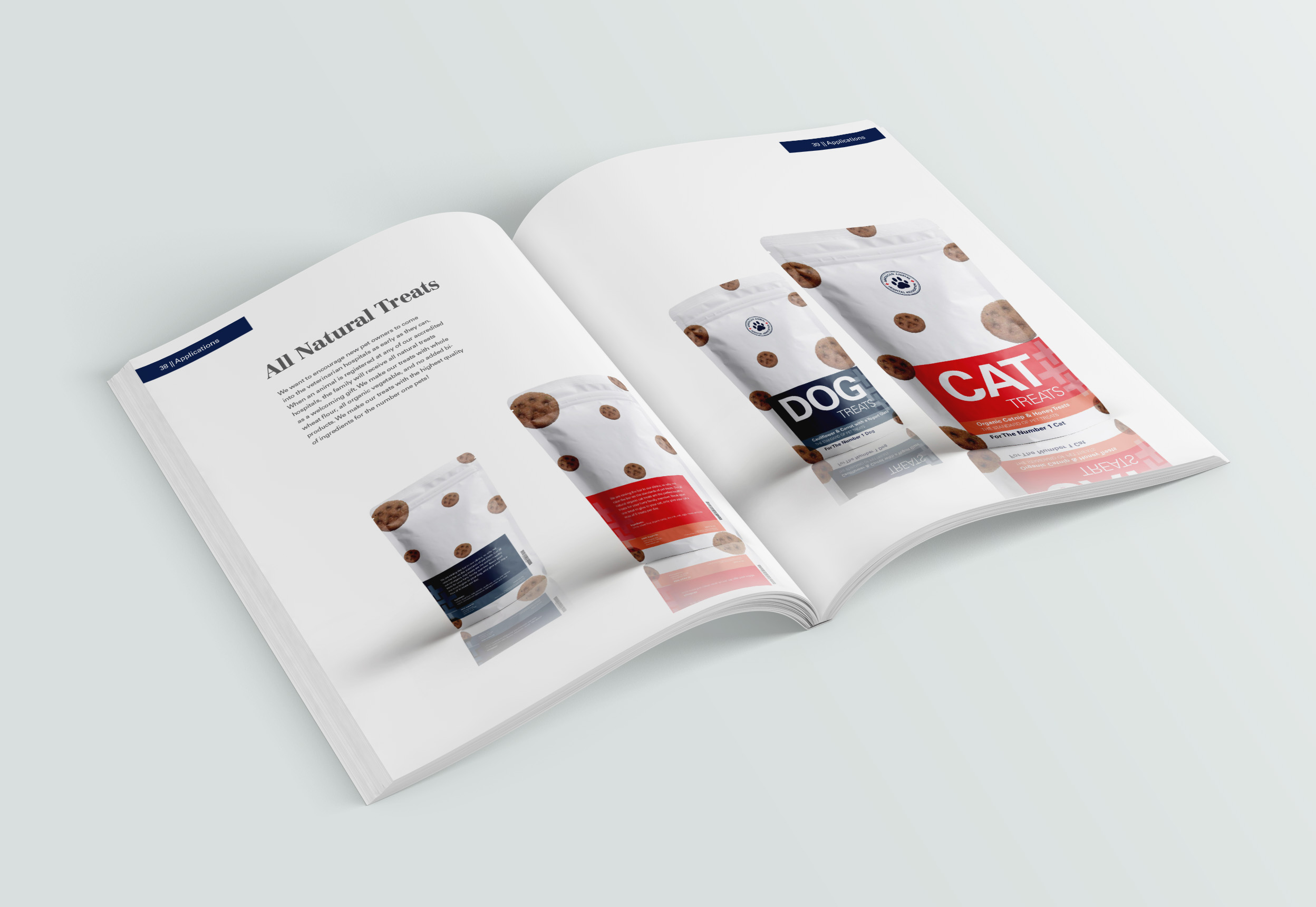
All Natural Treats: AAHA want to encourage new pet owners to come into the veterinarian hospitals as early as they can. When an animal is registered at any of their accredited hospitals, the family will receive all natural treats as a welcoming gift. They make their own treats with whole wheat flour, all organic vegetable, and no added bi-products. Each paw print on the treats were hand printed.
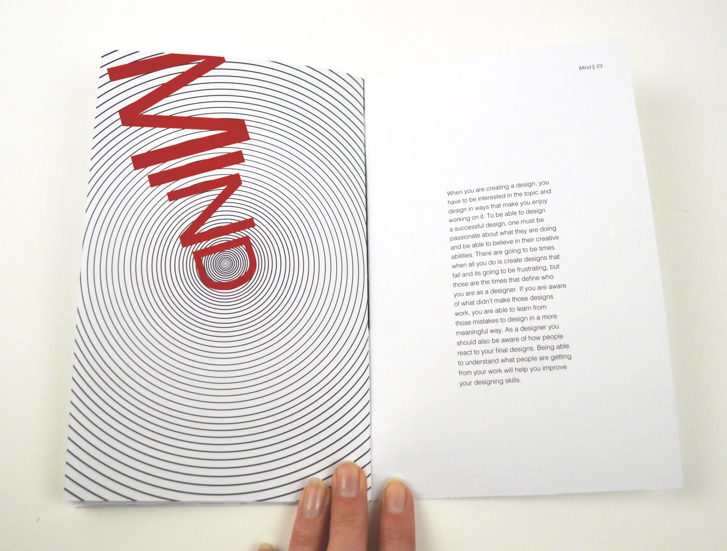
Six Designer Faculties goes through how each one of our five senses plus our mind is used in the design world. As a designer we want to engage the users, this book will go through how a designer can engage the user's different senses. The touch page for example is embossed with the word touch written in braille. As a designer we design for the user interaction and experience, we like to think about how can we make the user play with the piece longer. Each sense is shown in a unique way that really engages the reader and explains how the designer uses that sense.
I am interested in exploring the mind-body-spirit connection through the use of tea. For this project I explored how to perform a tea ritual called Tasseography. This is a tea ritual which one clears their mind while drinking the tea, rotates the cup three times, and then flips the cup upside down onto the saucer. Then once flipped back over, they read the symbols made by the tea leaves left behind in the cup. This allows the reader to reach into their subconscious. The idea that you can see symbols in a cup of tea to help us understand our subconscious is such an interesting idea; the reader controls the outcome of the readings. Whoever is reading the cup will see one thing but to another person could see a whole different symbol or could mean something else to them.
To begin my project I decided to do at least three tea reading rituals a day: morning, lunch, and dinner. I ended up collecting about 16 tea readings. In a small saddle stitch book, made for the readings, I took pictures of how each cup looked with all the tea symbols inside, documented the symbols, the meanings, and what type of tea was used for each tea reading. I had in mind a set of cups that could have a word that would put me into that mood, for example: a cup of relaxation, a cup of awesomeness, etc. I went back to the photos that I had taken and started to look at how they could be applied to these ceramic cups that I had thrown. I started to create really interesting designs with my tea reading photos over top the photos of my cups by drawing little lines that would represent the tea leafs. I decided to throw my own set of seven teacups that would make the loose leaf tea leaves form a patterns of tea leafs to start to hint about growth and development over time. I did this by adding a spiral indent to the cups form while it was wet on the wheel. At first I tried to carve the spiral inside the cup but it was is rough looking and people responded to the smooth gradual form change. Once I had the form of the cups and saucers made and bisque, I projected my photos of my tea readings onto them. With a pencil I traced the image and them filled it in with iron oxide wash hash marks. On the bottom of each cup has a word that would serve as a final reminder to clear your mind and to get into a peaceful state of mind before doing your readings. They all were glazed with 1234 celadon which should turn a transparent blue-green and the iron oxide wash would turn a black-brown color. When I unloaded the glaze kiln, the cups and saucers came out a weird color, not the color I was expecting and the hash marks did not show up at all. With quick thinking and help from a graduate ceramic student we came up with an idea of how to get the hash marks back onto the cup. The solution was to re-project, re-trace, and re-do the mark but this time with black luster. Then to make the luster stick to the ceramic piece I had to fire the cups and saucers a third time at cone 015. For the display, I made a 36-inches long 5.5-inches deep shelf with individual slots for each cup to sit in. On the front part of each slot is a hand painted word that is the same as the word on the bottom of that cup in that slot.